
10/8/2024

This is where design systems come into play. A design system is more than just a collection of UI components; it's a set of standards, principles, and tools that help teams create consistent user interfaces across products and platforms.
In this article, we’ll dive into why design systems have become essential for modern product design, how they foster efficiency, and why they are key to building scalable, cohesive digital products.

Design systems ensure that a brand’s digital products remain consistent, scalable, and easy to navigate, regardless of the platform or screen size. Without a solid system, designers and developers often find themselves reinventing the wheel for each new feature or product update, leading to inconsistencies in design and user experience.
The core benefit of a design system is that it creates a single source of truth. It allows teams to align around shared patterns and components, enabling faster iteration without sacrificing quality or brand consistency.
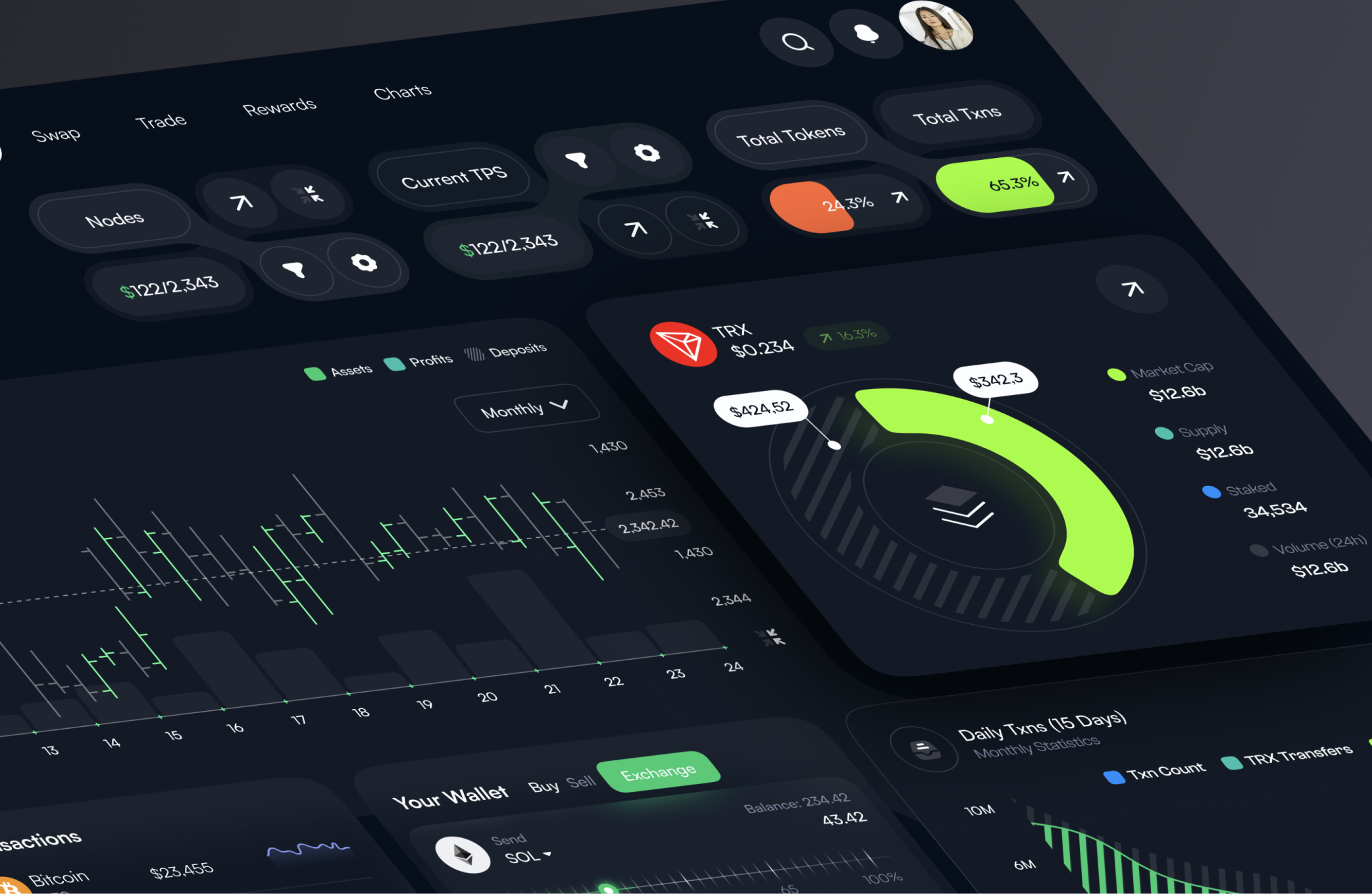
Efficiency and Scalability: A well-structured design system speeds up the design and development process by providing pre-built components that can be reused. This scalability becomes crucial as a company grows and their digital products expand, ensuring that new features fit seamlessly within the existing design framework.

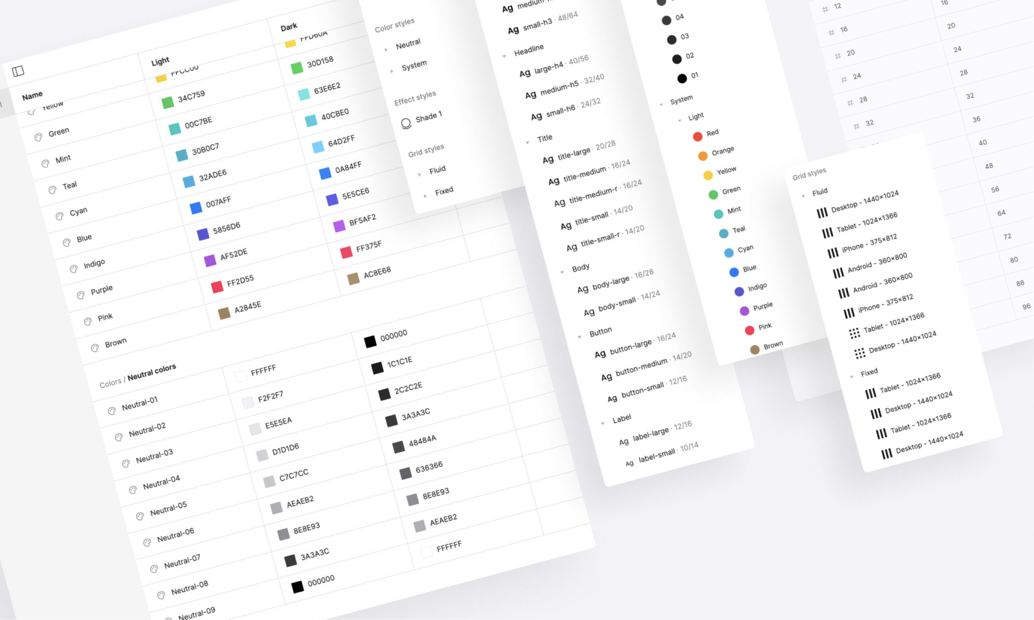
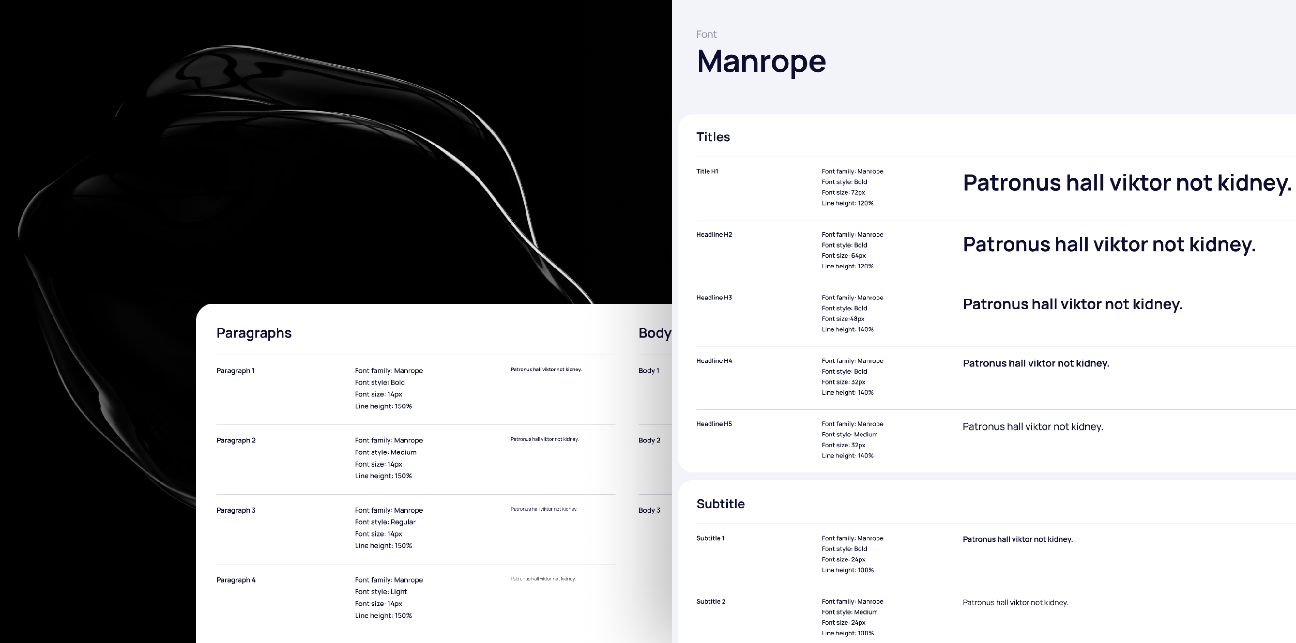
Design systems are composed of various elements, each serving a specific purpose in the overall product experience. While the structure of a system may vary between companies, most include the following:

A well-maintained design system enables cross-functional collaboration between designers, developers, and other stakeholders. It serves as a common language that facilitates smoother communication between teams. Designers no longer need to manually explain each component to developers, and developers can implement designs faster by referencing the system.
Moreover, it provides a foundation for feedback and iteration. When a system is documented and accessible, it’s easier for teams to propose and test improvements, creating a continuous feedback loop that improves the overall product.

Google’s Material Design system has become a widely adopted standard, offering a cohesive set of guidelines for building beautiful, responsive, and intuitive user interfaces. The consistency it provides has helped create a unified user experience across Google’s vast ecosystem of apps, from Gmail to Google Drive.
Airbnb’s DLS is another example of how a design system can scale a product while maintaining a high-quality user experience. It offers a set of flexible, reusable components that empower teams to innovate while ensuring consistency across all platforms.

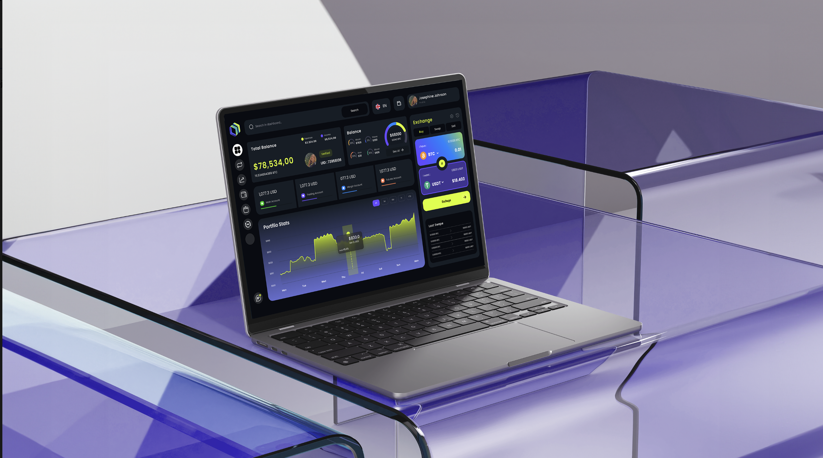
Design systems ultimately result in a more consistent, predictable, and enjoyable user experience. When users encounter a familiar interface, they know what to expect and can interact with the product more efficiently. Whether a user is on a mobile app or a desktop site, a well-implemented design system ensures that their experience is intuitive and seamless.
By reducing the cognitive load—making navigation and interactions more predictable—users can focus on the task at hand, whether that’s browsing products, completing a form, or reading content.

While consistency is essential, a design system shouldn’t stifle creativity. Designers should still have the freedom to innovate and solve new problems within the framework of the system. This balance is key to ensuring that a design system evolves alongside the product it supports.
Design systems should be treated as living documents, open to updates and adjustments as the needs of the product and users evolve.

Design systems have become a cornerstone of modern digital product design. By promoting consistency, scalability, and collaboration, they empower teams to build cohesive, user-friendly products that can grow alongside a company’s ambitions. Investing in a robust design system not only saves time and resources but also ensures that every interaction with your product is smooth, efficient, and enjoyable.
Ready to implement a design system in your own product? Start small, build a library of core components, and create a shared set of design guidelines that can evolve with your product.