

10/8/2024

These elements may seem basic, but they are key to creating visually appealing, balanced designs. This article will walk you through the basics of these principles and how they contribute to a successful design. Spacing is often an underappreciated component of design, yet it plays a critical role in enhancing readability and creating clean, professional layouts. Spacing refers to the areas between elements such as text, images, or graphics. Proper spacing ensures that your design is not cluttered, making it easier for users to focus on the content.
Key types of spacing include:
Incorporating ample white space into your design creates breathing room and can help guide the user’s eye from one section to another.
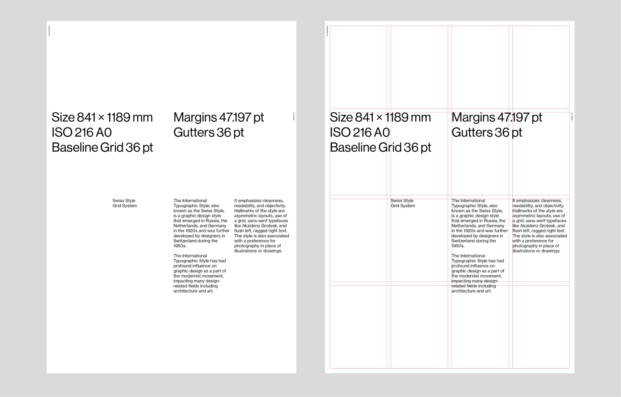
Alignment in design refers to how text, images, and other elements are lined up. Proper alignment makes a design appear more organized and aesthetically pleasing, enhancing the user's understanding of the content.
There are four main types of alignment:
Correct alignment creates a visual connection between related elements, making a design look cohesive and harmonious.
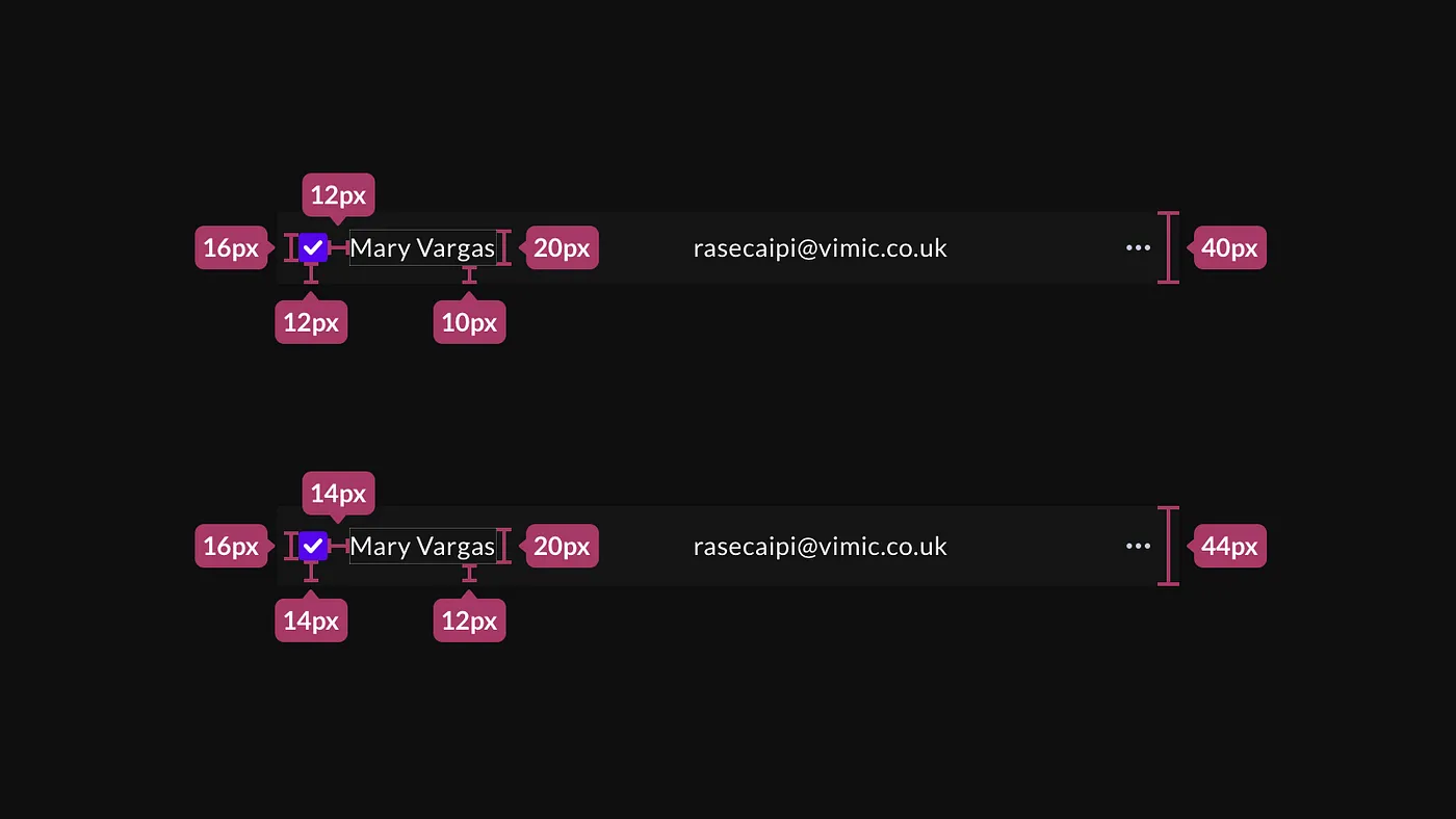
Grids are an essential tool for organizing content within a layout. They help maintain structure and consistency, whether you’re designing a website, a brochure, or a business card.
Grids are typically invisible, but their impact on design is profound. They act as a skeleton on which to place text, images, and other elements, ensuring a balanced and proportional design.
Some common grid structures include:
Grids can be as simple or complex as the project demands, but they are invaluable for creating order and consistency in your design work.
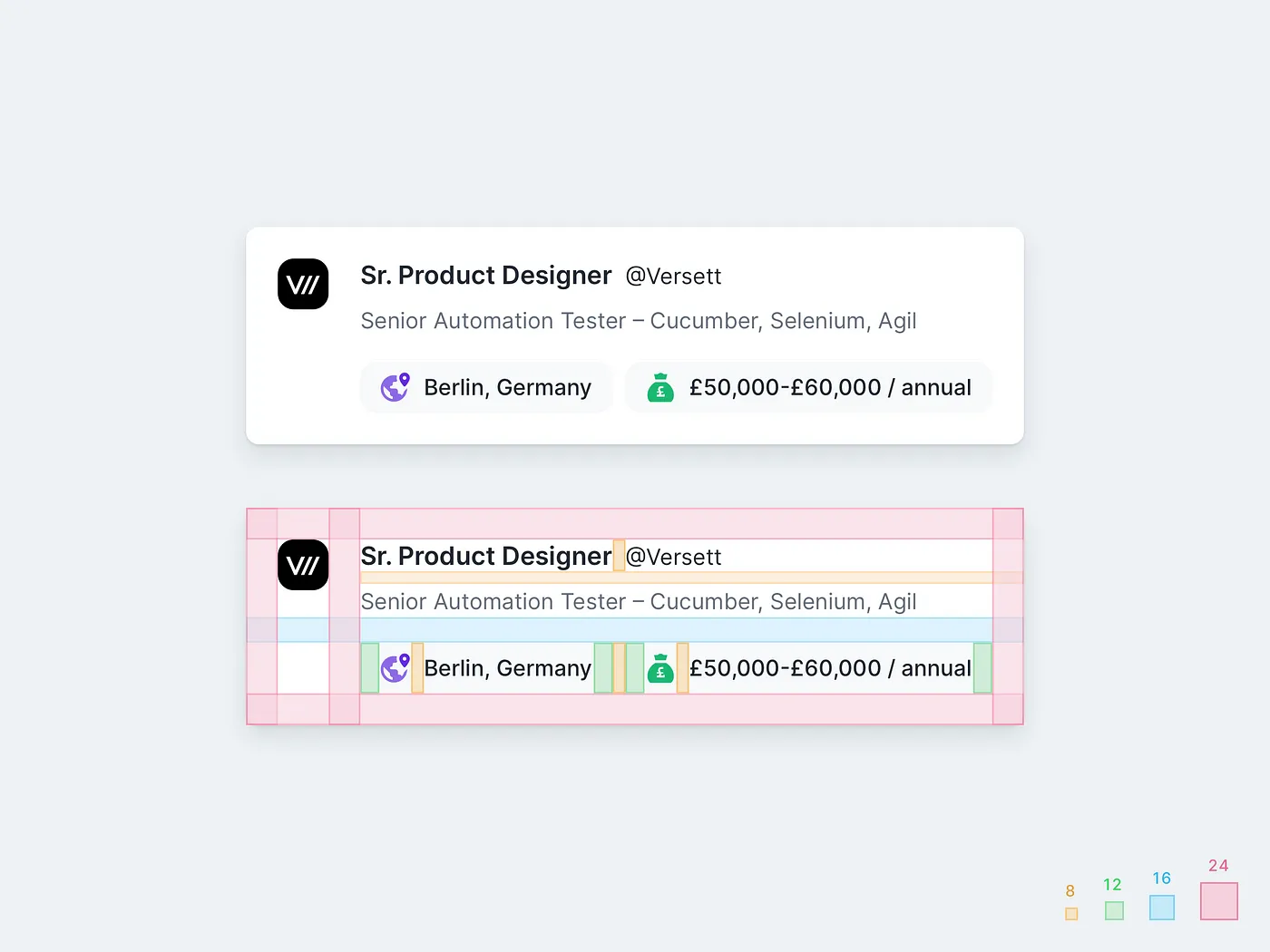
In the context of UI design, pixel grids play a crucial role in ensuring that all elements align seamlessly across devices and screen sizes. Grids are the backbone of creating consistent and scalable designs, allowing for fluid layouts that adapt to various screen resolutions. Using pixel grids ensures that the user interface remains harmonious, providing an intuitive and visually pleasing experience.
By following a pixel grid system, designers can achieve pixel-perfect precision, making sure every design element—from text to images—lines up neatly. This becomes especially important when dealing with responsive designs, as grids help maintain consistency across different screen sizes.

The 8-pixel grid has become the industry standard in UI design for good reason. It offers a straightforward and effective way to space and align elements consistently. By working in multiples of 8 pixels, designers ensure that all interface components align perfectly, making the design visually cohesive.
This system works exceptionally well across different screen resolutions, ensuring that the layout remains consistent from small mobile screens to large desktop displays. The 8-pixel grid also simplifies the handoff process between designers and developers, as both can work with a uniform system for spacing and layout.

While the 8-pixel grid is the go-to for most designs, the 4-pixel grid is gaining traction, especially in designs for high-resolution displays. The 4-pixel grid allows for more granular control, providing flexibility for smaller elements that need precise alignment. This finer grid system is ideal for modern, high-density displays like Retina or 4K screens, where smaller adjustments can greatly enhance visual clarity.
For UI elements that require high precision, such as icons, buttons, or small text fields, the 4-pixel grid offers more flexibility without sacrificing alignment consistency.
To establish a soft 4px grid, ensure all sizes, spacing (margins, padding) and line-heights in your designs are multiples of 4px. As simple as that.
Figma tip: The best way to use a baseline grid in Figma is to simply ensure you are using AutoLayout predominantly, and ensuring the margin and padding values are always multiples of 4.

A critical challenge in UI design is maintaining consistency across devices with varying screen sizes. Pixel grids provide a structured framework that ensures elements remain aligned and properly spaced across different devices, from mobile phones to tablets and desktops.
By adhering to grid systems like the 8-pixel or 4-pixel grids, designers can build layouts that scale smoothly across various screen sizes. These grids ensure that the user experience remains consistent, regardless of the device being used. This is especially important for responsive designs, where the layout must adapt to different breakpoints without losing its structure.
Pixel grids offer several technical benefits for UI design:

Spacing is very important in UI design because it makes the design neat and clean. UI looks logical (developers friendly), attractive and beautiful. Use principles of 8 point: 8px / 16px / 24px / 32px / 40px / 48px / 56px and so on for all padding and margin between elements (sometimes you can use 4px if you need to go in tight).
When you are designing make sure you use SVG format. If you intend on using or designing icons then use multiples of 8 (16×16, 24×24, 32×32, 40x40, etc). It will easily fit within the layout system.
8pt Grid on typography gives a much more harmonious vertical rhythm throughout designs.
Font size may vary from device to device, It could be 14px, 15px, 21px, etc but it’s important the line height will not. Line height should be a multiplication of 8 (8, 16, 24, 32 …) but if you want then you can use multiplication of 4 (4, 8, 12, 16, 20, 24…). Me personally use multiplication of 4 for line-height because it gives more fine-grained control and brings much better results.

Each of these elements—spacing, alignment, and grids—serves a unique purpose, but when combined, they create designs that are easy to navigate and aesthetically pleasing. For instance, proper alignment keeps elements structured, while appropriate spacing prevents overcrowding. Grids tie everything together by providing a framework that ensures consistency across all sections of your design.
Even experienced designers can make mistakes with spacing, alignment, and grids. Here are a few common pitfalls:
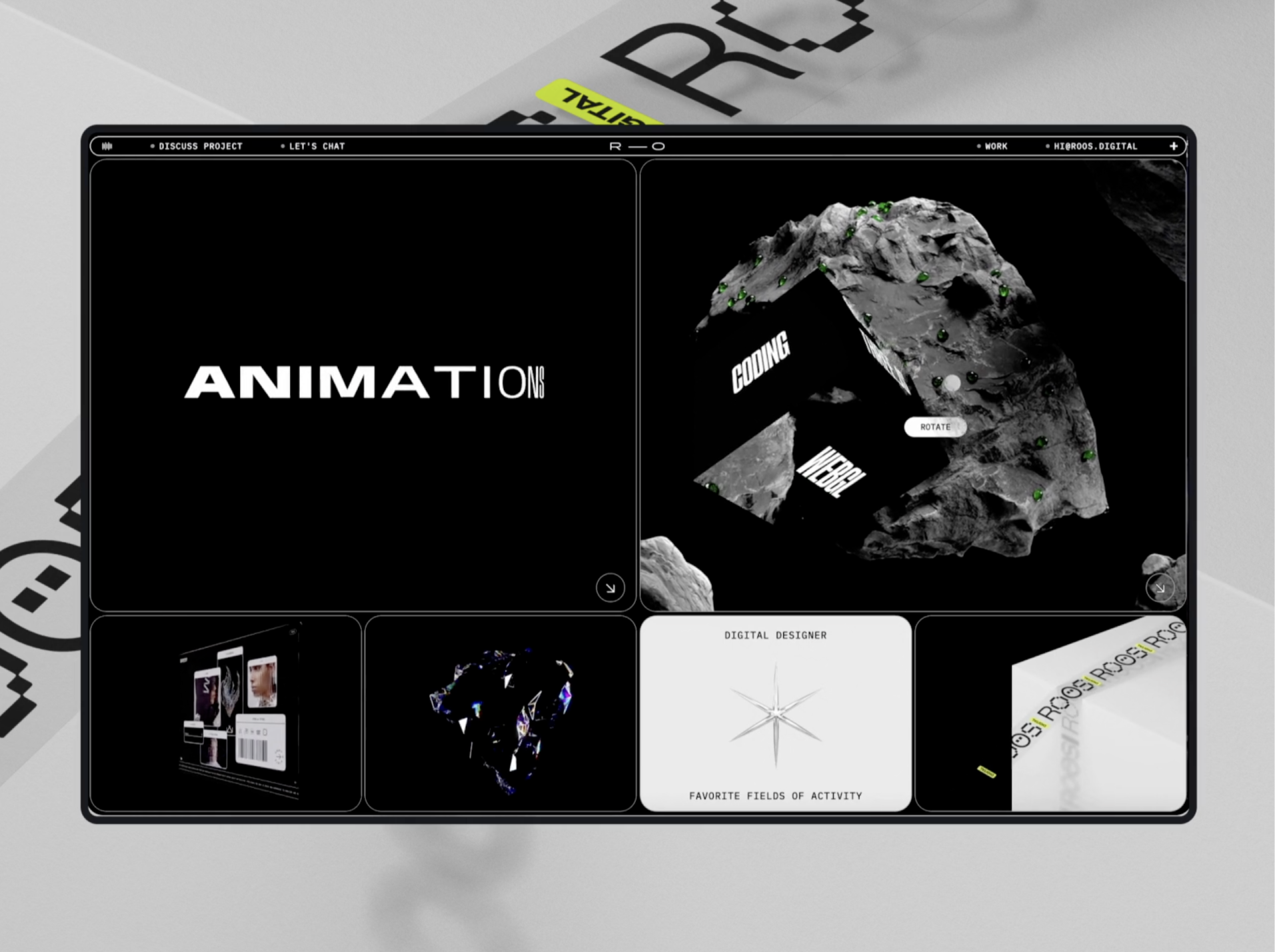
Remember, the grid system is a guide, not a strict rule. As designers, we're not bound by rigid formulas—we should be flexible and prioritize what looks and feels right. If a component doesn’t perfectly follow the 8px rule but enhances the design, trust your instincts and break the rule. One more thing: when collaborating on a project, make sure to share the grid system with your developers and help them understand its benefits. This will ensure consistency and efficiency across the entire design and development process.