30/5/2026 · 6 min read
Component-driven design flips the process. Instead of drawing screens and then breaking them apart, you build the smallest meaningful pieces first — buttons, inputs, badges, avatars — and assemble screens from those pieces. The result is a UI that scales gracefully because every screen inherits its consistency from the same foundation.
This approach has become the dominant model in product teams that ship quickly, yet it's still widely misunderstood. Many teams call their Figma file a design system when it's actually a collection of pasted screens. This article is about the real thing: a component hierarchy you can build, extend, and hand off without everything falling apart.
Brad Frost's Atomic Design model remains the clearest mental model for structuring UI components. Atoms are the indivisible elements — a color token, a type style, an icon, a single input field. Molecules are combinations of atoms that form a functional unit, like a search field with its label and submit button. Organisms are complete sections of a UI — a navigation bar, a card grid, a checkout form — built from molecules and atoms.
The hierarchy matters because it dictates where decisions live. A color change at the atom level ripples correctly through every molecule and organism that uses it. A color change made directly on an organism is a one-off that will drift from everything else. Most design system debt comes from teams making changes at the wrong level of the hierarchy.
In practice, the exact labels matter less than the principle: always make changes at the lowest possible level, and let those changes propagate upward. This is what gives component-driven design its force — not the naming convention, but the discipline of composition.
Naming is the first thing that breaks. When your Figma file has "Button", "Button (new)", "Button FINAL", and "Button — Hana's version", you no longer have a design system. You have a file full of shapes. Good component naming follows a consistent pattern — usually Category/Component/Variant — and is enforced at the team level from day one.
A naming schema like Form/Input/Default, Form/Input/Error, Form/Input/Disabled does two things: it keeps the Figma assets panel readable, and it communicates intent to developers who implement these in code. When your design names match your code names, handoff becomes a conversation about behavior rather than a scavenger hunt for the right component.
Organization within a file follows the same logic. Separate your foundation (tokens, primitives) from your core components and then from your patterns. A "Kitchen Sink" page where everything lives together becomes unusable the moment your system has more than thirty components. Structure it like a library because that's what it is.

Every interactive component has states — default, hover, focus, active, disabled, loading, error. Designing only the default is the single most common mistake in component-driven work. It looks fine in the presentation, and then breaks in production the moment a user tabs through a form or submits with a network error.
Figma's Variants feature maps directly to the states your engineers need. A button with variants for size (small, medium, large) and state (default, hover, disabled, loading) gives your team a single source of truth for every possible rendering of that button. The extra work upfront pays back immediately during implementation — no questions, no improvisation, no inconsistencies.
Beyond interactive states, think about data states: empty, partial, and overflow. A card component that only designs for the happy path — clean headline, short description, nice image — will look broken with a 200-character title or a missing image. Design the edges, not just the ideal. This is where the difference between a good component and a production-ready component lives.
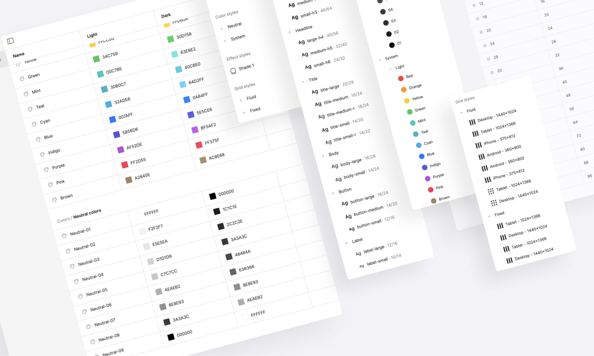
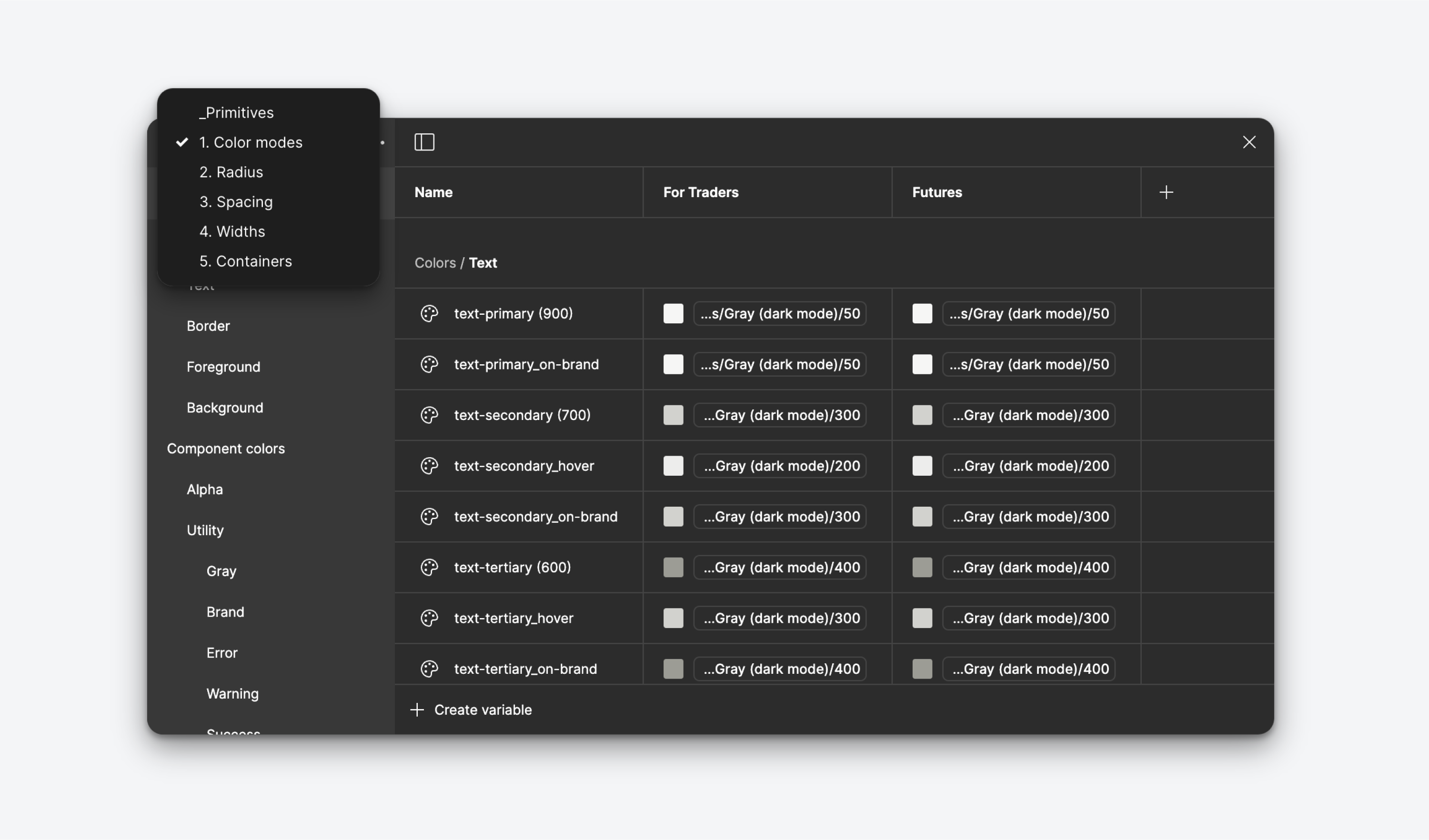
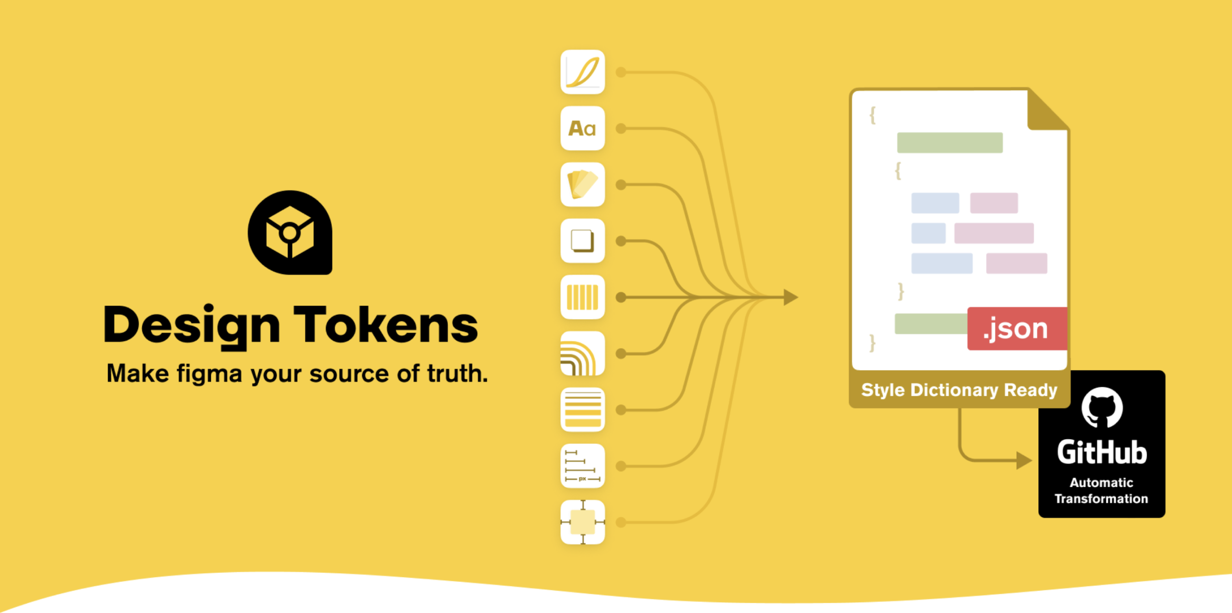
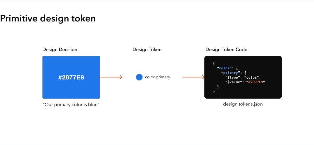
Design tokens are the named values that underpin your component system — colors, spacing, typography sizes, border radii, shadows. Without tokens, your components carry their values embedded and invisible. Change your brand's primary color and you're hunting through hundreds of components updating hex codes. With tokens, you change one value and the entire system updates.
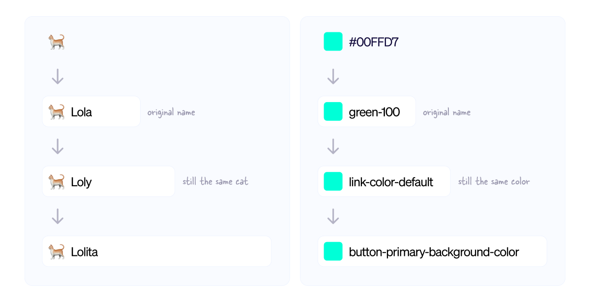
The key distinction is between global tokens (raw values like blue-500: #3B82F6) and semantic tokens (role-based aliases like color-action-primary: {blue-500}). Semantic tokens are what your components reference. This two-layer structure is what lets you support theming — dark mode, white-label variants, accessibility overrides — without rebuilding components from scratch.
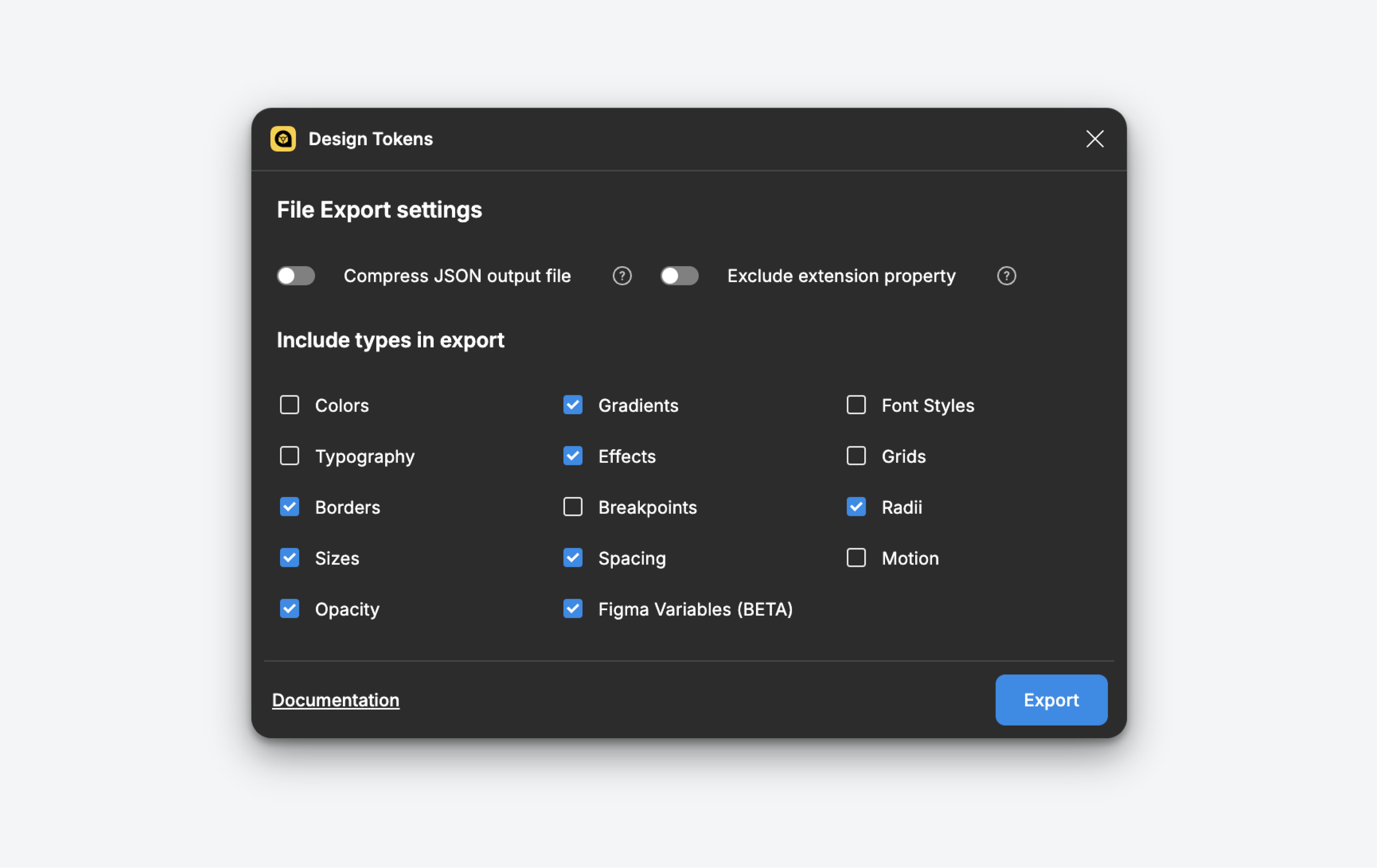
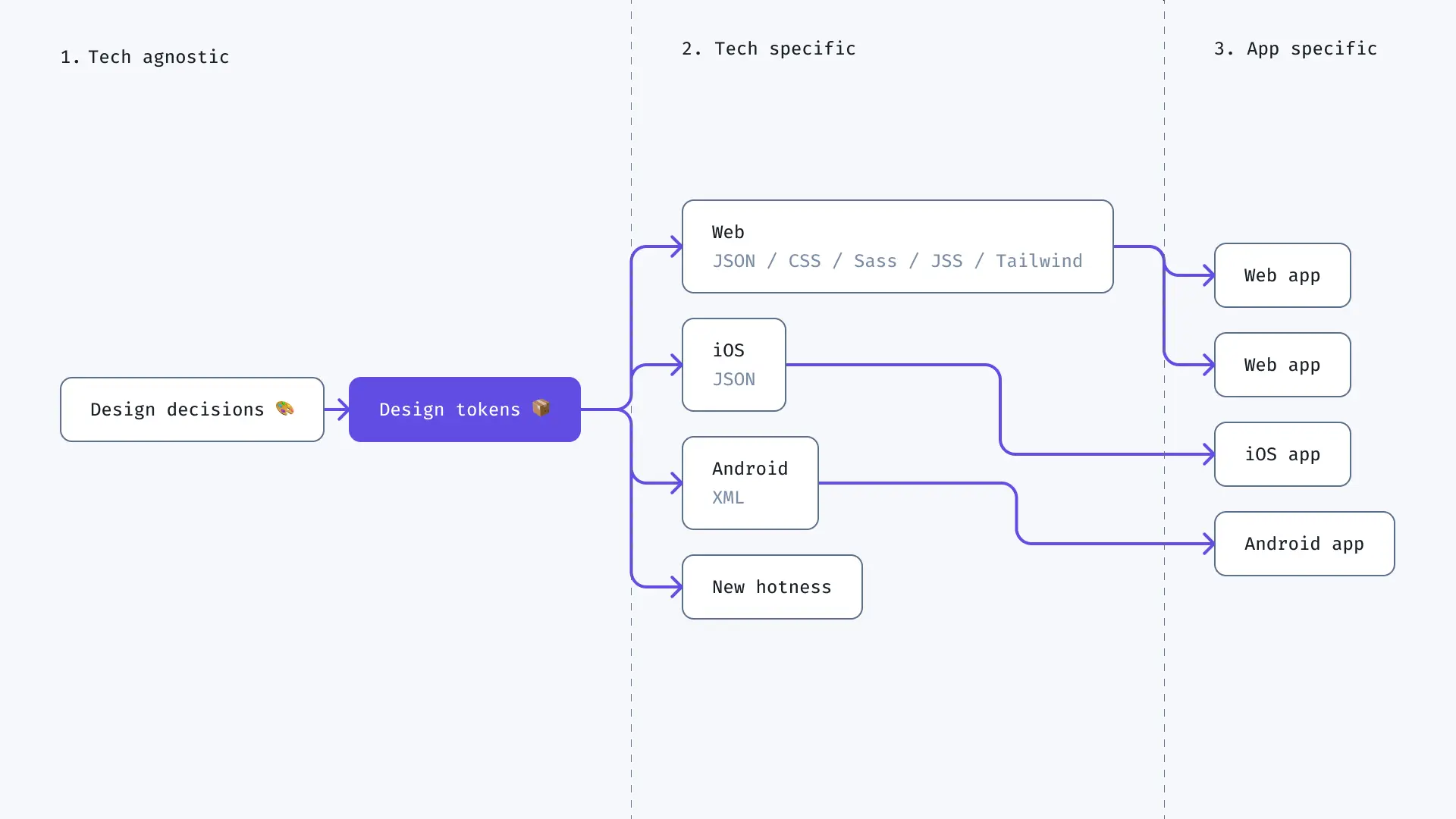
In 2026, the handoff mechanism for tokens has stabilized around JSON-based formats and tools like Style Dictionary, Tokens Studio, and Theo. If your design tokens aren't being exported to the same format your engineers consume, you still have a synchronization problem — just a manual one. Close that gap and your design-code contract becomes automatic.
Component-driven design fails when teams treat it as a one-time project rather than an ongoing practice. The design system gets built, handed to someone to "maintain," and then slowly stops reflecting what's actually being shipped. New patterns appear in the product without ever making it back to the system. Within six months, the system is a historical artifact and teams have stopped using it.
The fix is governance, not tooling. Decide upfront who can add components, what the review process is, and how deprecated components are retired. Even a team of two needs this. The moment a component is added to the system without review, you've introduced drift — and drift compounds faster than you think.
The other failure mode is over-engineering early. A startup does not need a system with eight button variants, twelve spacing scales, and a full accessibility spec on day one. Build what you need now, with the naming and structure that will let you extend cleanly later. The best design system is the one your team actually uses, not the one that looks impressive in a Figma presentation.
The teams that do it well aren't the ones with the most sophisticated systems. They're the ones who maintain discipline about composition: always building from atoms up, always naming consistently, always designing states, always keeping tokens synchronized. That discipline is what makes a codebase fast to extend and a Figma file safe to hand off.
Start small. Pick your most-used component — probably a button — and do it right. Define its tokens. Build every variant. Design every state. Write the documentation. Then do the next one. After ten components done properly, you have a system. After fifty, you have leverage.