28/5/2026 · 13 min read
For most of Figma's history, styles were the closest thing to a design token system the tool offered. Colour styles, text styles, effect styles — useful, but static. They held a single value and they held it forever. Swapping a theme meant updating every style by hand, and the gap between what the designer called a "token" and what the developer received in a handoff was, at best, a naming convention and a prayer.
Variables changed that equation fundamentally. A variable is a named
container that can hold different values in different modes, be aliased by other
variables, and be scoped to exactly the properties it is meant to govern. A colour
called surface/background can resolve to #FFFFFF in light mode
and #121212 in dark mode without touching a single component. That is not
a style update — that is a design system doing its job.
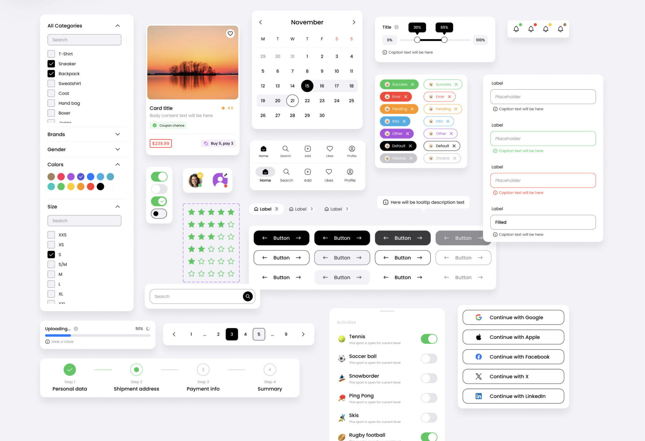
A style in Figma is a saved property value: a specific hex colour, a specific type ramp entry, a specific shadow. It lives in the file or library it was created in, it applies directly to a layer, and it has exactly one value. When you update the style, every layer using it updates too — which is powerful, but it is still a one-to-one mapping between name and value.
A variable is different in three important ways. First, a variable can
hold multiple values — one per mode. A single variable named
color/text/primary can store a light-mode value and a dark-mode value
simultaneously. Switching the mode on a frame switches every variable in that frame
to its alternate value instantly. Second, a variable can be aliased. A semantic
variable like color/button/label can point to a primitive variable like
color/neutral/white rather than storing a raw hex value — which means
changing the primitive ripples through every alias automatically. Third, variables
are typed. Colour, number, string, and boolean variables behave differently, can be
scoped to specific Figma properties, and surface correctly in the Figma Dev Mode
handoff panel.
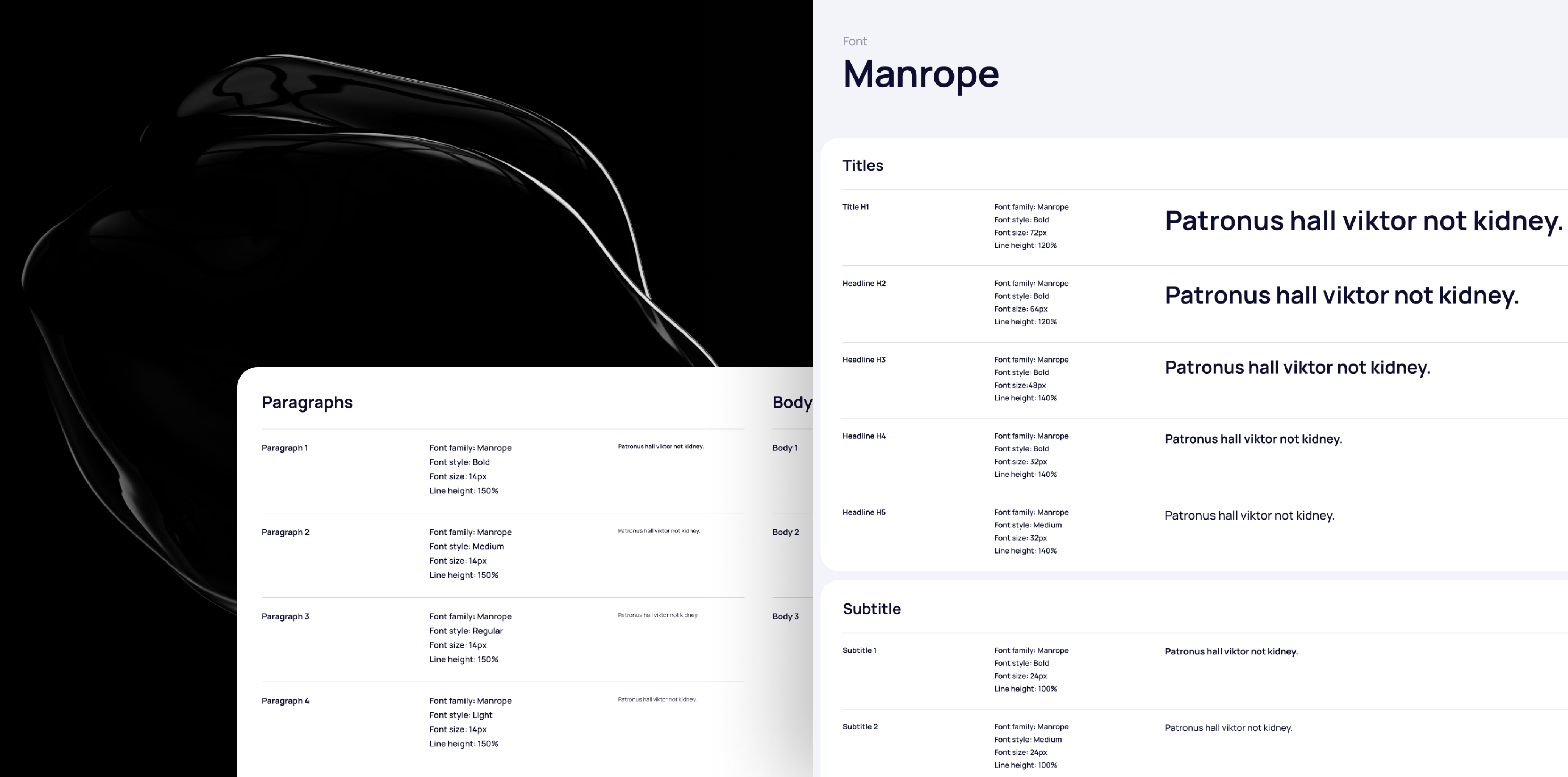
Styles still have their place — primarily for complex values like typography composites and effects that variables cannot yet express fully. But for any value that might change with a theme, a mode, or a brand switch, variables are the right tool. A mature design system in 2026 uses variables for colour, spacing, border radius, opacity, and component-level toggles, and reserves styles for the composite type definitions that sit on top of them.
The most consequential architectural decision in a variable-based design system is the hierarchy. Get it right and the system scales across brands, themes, and product lines with almost no friction. Get it wrong and you end up with hundreds of disconnected variables that are harder to maintain than the styles they replaced.
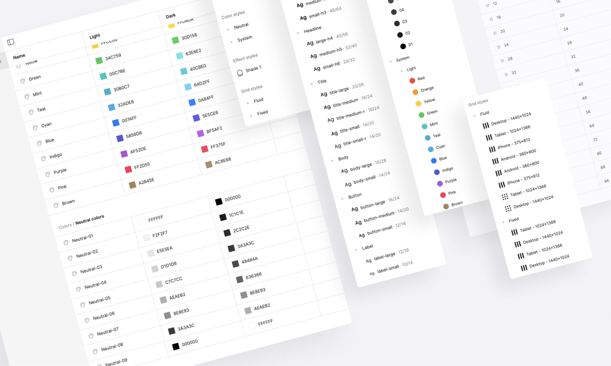
The three-layer model that has emerged as the industry standard breaks the
hierarchy into primitives, semantics, and components. Primitives are the raw values —
the complete colour palette, the spacing scale, the type sizes. They are named for
what they are, not what they do. color/blue/500, space/4,
radius/md. They have no modes; they are the ground truth the rest of
the system builds on.
Semantic variables are aliases into the primitive layer, named for their
purpose rather than their value. color/text/primary points to
color/neutral/900 in light mode and color/neutral/50 in dark
mode. space/component/padding-md points to space/4. The
semantic layer is where modes live and where the design system communicates intent to
both designers and developers. A developer reading color/surface/overlay
knows exactly where to use it without needing to look up its hex value.
color/red/400, space/8,
font-size/lg.Component-level variables are the most debated layer. Some teams skip them entirely and wire components directly to semantics. That works well for simple systems but breaks down when individual components need their own density or size variants that do not map cleanly to the shared semantic scale. The pragmatic answer is to add component variables only when a component has more than two or three unique values that are not already expressed by the semantic layer.
Modes are what make variables categorically more powerful than styles. A mode is an alternate value set for a collection of variables — flip the mode on a frame and every variable in that frame resolves to its alternate value. The canonical example is light and dark mode, but modes can express anything that needs to shift together: brand themes, accessibility variants, density scales, language-specific typography overrides.
The key constraint to understand is that modes live on collections, not on
individual variables. Every variable in a collection shares the same mode definitions.
That means collection architecture and mode architecture are the same decision.
A single Color collection with light and dark modes works until you need
brand-level colour overrides — at which point you either add brand as a second
dimension (which Figma does not natively support as nested modes) or you split into
separate collections per brand, each with its own light and dark modes.
The practical architecture most teams land on in 2026 uses three to four
collections. A Primitives collection with no modes. A Color
semantic collection with light and dark modes. A Brand collection that
overrides a small subset of semantic colours per brand identity — primary, accent,
on-brand surface. A Density or Spacing collection with
default, compact, and comfortable modes for products that need to adapt to different
screen densities or user preferences.
One underused pattern is the boolean variable as a mode signal. A variable
named feature/new-nav/enabled of type boolean can be used in component
conditional logic to show or hide layers, effectively making feature flags a first-class
design system concept. Design teams that have adopted this pattern can prototype
feature-flagged variants directly in Figma without duplicating frames.

Colour variables get most of the attention, but number variables applied to spacing and sizing are where variables unlock the most day-to-day design system efficiency. Auto layout in Figma accepts variable bindings for gap, padding, min width, max width, and fixed dimensions — which means a component can express its spatial behaviour in terms of the token system rather than hard-coded pixel values.
The practical impact is significant. A card component with
space/component/padding-md bound to its internal padding and
space/component/gap-sm bound to its content gap can shift from
comfortable to compact density by switching the spacing collection mode on its
parent frame. No component editing required. The spatial relationships are preserved;
only the scale shifts.
For this to work cleanly, the spacing token scale needs to be designed with
density in mind from the start. A scale that uses raw pixel multiples of 4
(4, 8, 12, 16, 24, 32, 48) maps well to a compact mode that uses multiples
of 3 (3, 6, 9, 12, 18, 24, 36). The ratios are preserved; everything
feels intentionally smaller rather than arbitrarily shrunk. Teams that try to retrofit
density onto a spacing system designed without modes usually find that the compact
values look wrong because the original scale was not built with a consistent ratio.
Corner radius and stroke width are two more properties that benefit from
variable binding in auto layout components. A design system with a
radius/component/interactive variable can change the rounding character
of every interactive element — buttons, inputs, chips — by updating a single value,
without touching any component directly. This is the spatial equivalent of a semantic
colour token, and it is underused in most design systems that have otherwise moved
fully to variables.
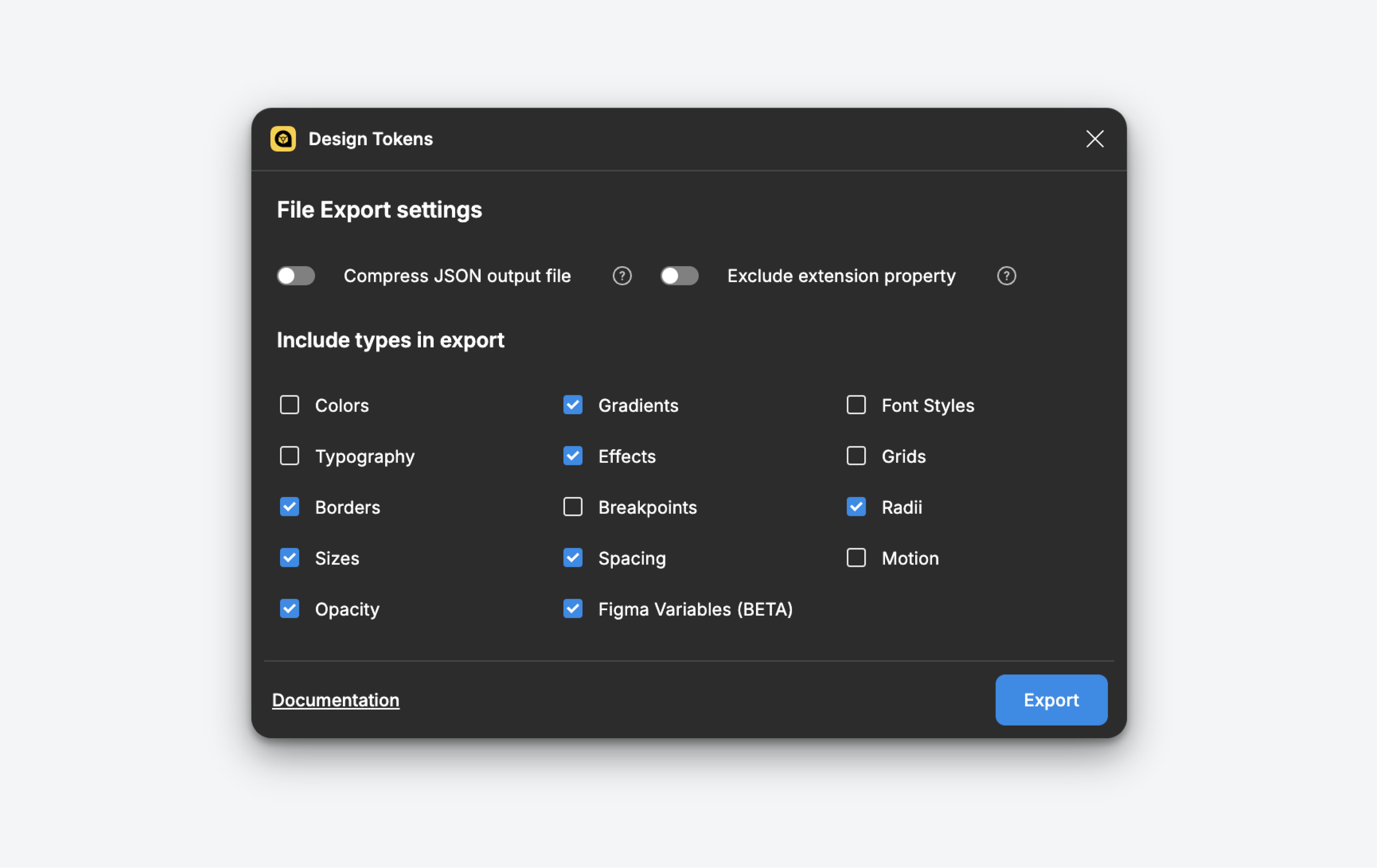
The gap between Figma variables and production design tokens has closed significantly in 2026, but it has not disappeared entirely. The pipeline from Figma variable to CSS custom property to design token in a code repository still requires deliberate architecture decisions on both the design and engineering side to work without manual intervention.
The naming convention is the most critical alignment point. If the Figma
variable is named color/text/primary and the CSS custom property is
named --color-text-primary and the Tailwind config token is named
text-primary, the three are recognisably the same thing even across
toolchains. Teams that let naming drift — using different separators, different
capitalisation conventions, or different semantic groupings — end up with a handoff
that requires a human translator at every update cycle.
Figma Dev Mode surfaces variables in the inspect panel alongside the raw
resolved value. A developer inspecting a button label sees
color/text/on-primary next to #FFFFFF — the token name and
the fallback value together. That pairing is what makes the handoff work: the developer
can implement against the token name and trust that the resolved value is correct for
the current mode. For teams using the Tokens Studio plugin, the sync pipeline can go
further — exporting Figma variables directly to a JSON tokens file that feeds a
Style Dictionary build, producing platform-specific outputs for web, iOS, and Android
from a single source of truth in Figma.
Color/dark mode in Figma should map explicitly to the
prefers-color-scheme: dark media query output.Variable scoping is one of the most powerful and least understood features in Figma's variable implementation. Scoping lets you restrict which Figma properties a variable can be applied to — a spacing variable can be scoped to gap, padding, and width properties only, making it invisible in the colour picker. This is not just organisational tidiness; it is a guardrail that prevents variables from being misapplied, which in a large team with many designers is the difference between a system that holds its integrity and one that quietly accumulates inconsistencies.
The scoping taxonomy that works best in practice aligns with the three hierarchy layers. Primitive variables are scoped narrowly — a primitive colour is scoped to nothing at all, making it invisible in the variable picker for most properties and forcing designers to use the semantic layer. Semantic variables are scoped to the properties they represent: fill, stroke, text colour, gap, padding. Component variables are scoped to the properties of the specific component they serve, often a single property like corner radius or minimum height.
Publishing is where the library architecture decisions become consequential at scale. Figma lets you publish variables as part of a team library and control which collections are included. The pattern that scales best separates primitive collections from semantic and component collections across different library files. The primitive library is owned by a small core team, changes rarely, and is consumed by the semantic library. The semantic library is the one published to all product teams. Component-level variables live in the component libraries alongside the components themselves. This separation means that a product team can override a semantic variable for their specific brand context without touching the primitive source of truth.
The governance model for publishing matters as much as the technical architecture. Variable changes are silent in Figma — unlike component updates, there is no notification when a subscribed library updates its variables. Teams that have handled this well establish a changelog convention alongside the library: a pinned comment or a linked Notion page that documents every variable addition, deprecation, and value change with a semantic version number. Consumers of the library can then decide when to accept updates and what they need to test when they do.
The shift from styles to variables is not primarily a technical migration. It is a change in how a design team thinks about the relationship between names and values. Styles said "this layer is this colour". Variables say "this layer has this role, and the colour that expresses that role depends on the context the layer is rendered in". That semantic indirection is what makes the system composable, themeable, and maintainable at scale.
The teams getting the most out of variables in 2026 share a few common traits. They invested in the hierarchy before they invested in the components — a well-designed primitive and semantic layer pays compound interest over time. They aligned naming conventions with engineering before writing a single token, so the handoff works without translation. They used scoping deliberately to make the system self-documenting — a designer who can only see the tokens appropriate for the property they are editing is a designer who applies the system correctly without needing to read a style guide.
If you are starting a new design system or migrating an existing one, the order of operations matters. Start with the primitive colour scale and spacing scale. Map semantics onto them with modes defined before any components are built. Scope everything as you go. Wire the first few components to the semantic layer and see how a mode switch behaves — that first successful theme flip is the moment a design system stops being a collection of assets and starts being infrastructure. Everything built on top of it from that point forward inherits the system's ability to change.