12/6/2026 · 15 min read
This article is the sequel to my earlier introduction to design tokens. If you're already comfortable with the basics — primitives, semantics, component tokens — this is where things get genuinely complex. We're talking about multi-tier token architecture, brand aliasing, theme switching at runtime, and the tooling decisions that make or break a large-scale system.
The classic token setup — a flat JSON file with color, spacing and typography values — works perfectly for a single product with a single theme. The moment you add a second brand or a white-label requirement, the cracks appear. You either duplicate everything (which defeats the purpose) or you try to parametrise values that weren't designed to be parametric.
color-primary is #FF3639. Brand B's color-primary is #3358ED. If tokens live in a single namespace, one overwrites the other.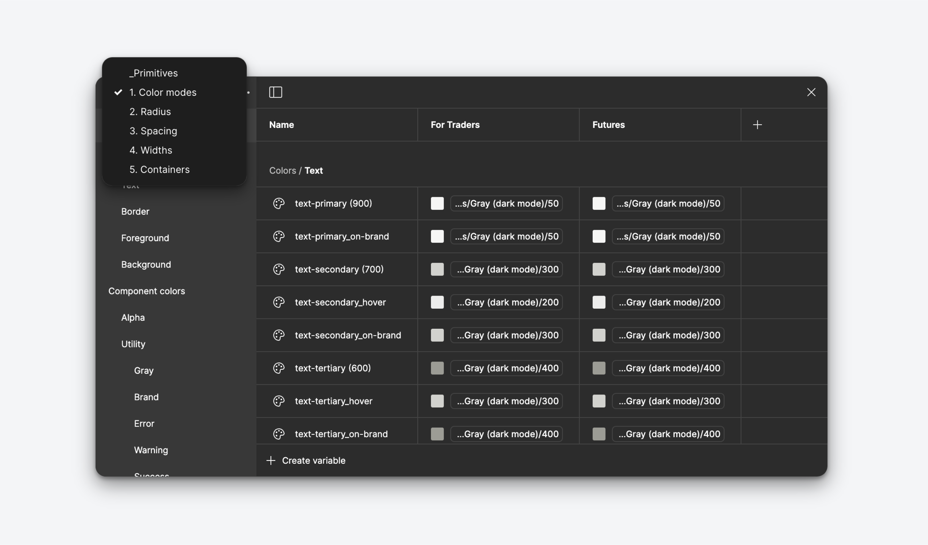
The most robust pattern for large-scale systems uses three distinct tiers. Each tier has a clear purpose and a clear rule about who can reference it.
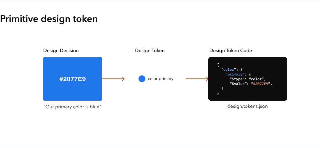
These are your raw values. No semantics, no context. Just the complete palette of everything your system can express.
{
  "primitive": {
    "color": {
      "red-100": { "value": "#FFF0F0" },
      "red-500": { "value": "#FF3639" },
      "red-900": { "value": "#5C0002" },
      "blue-500": { "value": "#3358ED" },
      "neutral-0":   { "value": "#FFFFFF" },
      "neutral-1000": { "value": "#000000" }
    },
    "spacing": {
      "4":  { "value": "4px" },
      "8":  { "value": "8px" },
      "16": { "value": "16px" },
      "24": { "value": "24px" },
      "32": { "value": "32px" }
    }
  }
}
Rule: primitive tokens never reference other tokens. They only hold raw values. They are never used directly in components.
Semantic tokens assign meaning. They reference primitives by alias and describe intent rather than appearance.
/* Brand A */
{
  "semantic": {
    "color": {
      "brand-primary":     { "value": "{primitive.color.red-500}" },
      "brand-primary-subtle": { "value": "{primitive.color.red-100}" },
      "surface-default":   { "value": "{primitive.color.neutral-0}" },
      "surface-inverse":   { "value": "{primitive.color.neutral-1000}" },
      "text-primary":      { "value": "{primitive.color.neutral-1000}" }
    }
  }
}

/* Brand B — swap just this file */
{
  "semantic": {
    "color": {
      "brand-primary":     { "value": "{primitive.color.blue-500}" },
      "brand-primary-subtle": { "value": "{primitive.color.blue-100}" },
      "surface-default":   { "value": "{primitive.color.neutral-0}" },
      "surface-inverse":   { "value": "{primitive.color.neutral-1000}" },
      "text-primary":      { "value": "{primitive.color.neutral-1000}" }
    }
  }
}Component tokens map semantic tokens to specific UI elements. They're the last mile of the system.
{
  "component": {
    "button": {
      "background-default":  { "value": "{semantic.color.brand-primary}" },
      "background-hover":    { "value": "{semantic.color.brand-primary-subtle}" },
      "text":                { "value": "{semantic.color.surface-default}" },
      "border-radius":       { "value": "{primitive.spacing.8}" }
    }
  }
}
The power: swapping Brand A for Brand B only requires replacing the semantic tier file. The primitive tier and component tier stay identical.
The common mistake is creating a separate dark mode token file that duplicates all component and semantic tokens. Instead, dark mode should only swap values at the semantic tier.
/* light.json — default semantic layer */
{
  "semantic": {
    "color": {
      "surface-default": { "value": "{primitive.color.neutral-0}" },
      "surface-raised":  { "value": "{primitive.color.neutral-50}" },
      "text-primary":    { "value": "{primitive.color.neutral-1000}" },
      "text-secondary":  { "value": "{primitive.color.neutral-600}" }
    }
  }
}

/* dark.json — only overrides what changes */
{
  "semantic": {
    "color": {
      "surface-default": { "value": "{primitive.color.neutral-1000}" },
      "surface-raised":  { "value": "{primitive.color.neutral-900}" },
      "text-primary":    { "value": "{primitive.color.neutral-0}" },
      "text-secondary":  { "value": "{primitive.color.neutral-400}" }
    }
  }
}
Notice: brand-primary doesn't appear in the dark theme file. It doesn't need to — the brand colour stays consistent across themes. Only surface and text roles switch.
The cleanest way to implement this in production is to export all semantic tokens as CSS custom properties scoped to a theme attribute:
:root,
[data-theme="light"] {
  --color-surface-default: #FFFFFF;
  --color-surface-raised: #F5F5F5;
  --color-text-primary: #000000;
  --color-brand-primary: #FF3639;
}

[data-theme="dark"] {
  --color-surface-default: #000000;
  --color-surface-raised: #111111;
  --color-text-primary: #FFFFFF;
  /* brand-primary intentionally omitted — inherits from :root */
}

/* Theme switch: just one attribute */
document.documentElement.setAttribute('data-theme', 'dark');
Style Dictionary is the de-facto standard for transforming token JSON into platform-specific outputs. At scale, the configuration becomes as important as the tokens themselves.
// style-dictionary.config.js
module.exports = {
  source: [
    'tokens/primitive/**/*.json',
    'tokens/semantic/brand-a/**/*.json',  // swap for brand-b
    'tokens/semantic/light/**/*.json',     // swap for dark
    'tokens/component/**/*.json'
  ],
  platforms: {
    css: {
      transformGroup: 'css',
      prefix: 'sd',
      buildPath: 'dist/css/',
      files: [
        {
          destination: 'variables.css',
          format: 'css/variables',
          options: { outputReferences: true }
        }
      ]
    },
    ios: {
      transformGroup: 'ios-swift',
      buildPath: 'dist/ios/',
      files: [{ destination: 'StyleDictionary.swift', format: 'ios-swift/class.swift' }]
    },
    android: {
      transformGroup: 'android',
      buildPath: 'dist/android/',
      files: [{ destination: 'tokens.xml', format: 'android/resources' }]
    }
  }
};
The key is the source array. Your CI/CD pipeline passes the brand and theme as environment variables, and your config selects the right token files to compile. Every platform gets one build command, consistent output, zero manual merging.
// build-tokens.js
const brands = ['brand-a', 'brand-b', 'brand-c'];
const themes = ['light', 'dark'];

brands.forEach(brand => {
  themes.forEach(theme => {
    const config = buildConfig({ brand, theme });
    StyleDictionary.extend(config).buildAllPlatforms();
    console.log(`Built ${brand}/${theme}`);
  });
});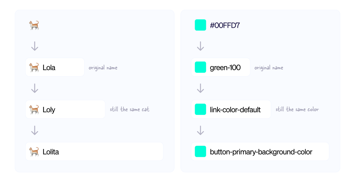
Technical architecture without governance collapses. At scale, you need explicit rules about token ownership.
/* Mark deprecated tokens with a comment and a redirect */
{
  "semantic": {
    "color": {
      "cta-color": {
        "value": "{semantic.color.brand-primary}",
        "deprecated": true,
        "comment": "Use brand-primary instead. Removed in v4.0."
      }
    }
  }
}
Style Dictionary can be configured to emit console warnings for deprecated tokens during build, giving consuming teams time to migrate before removal.
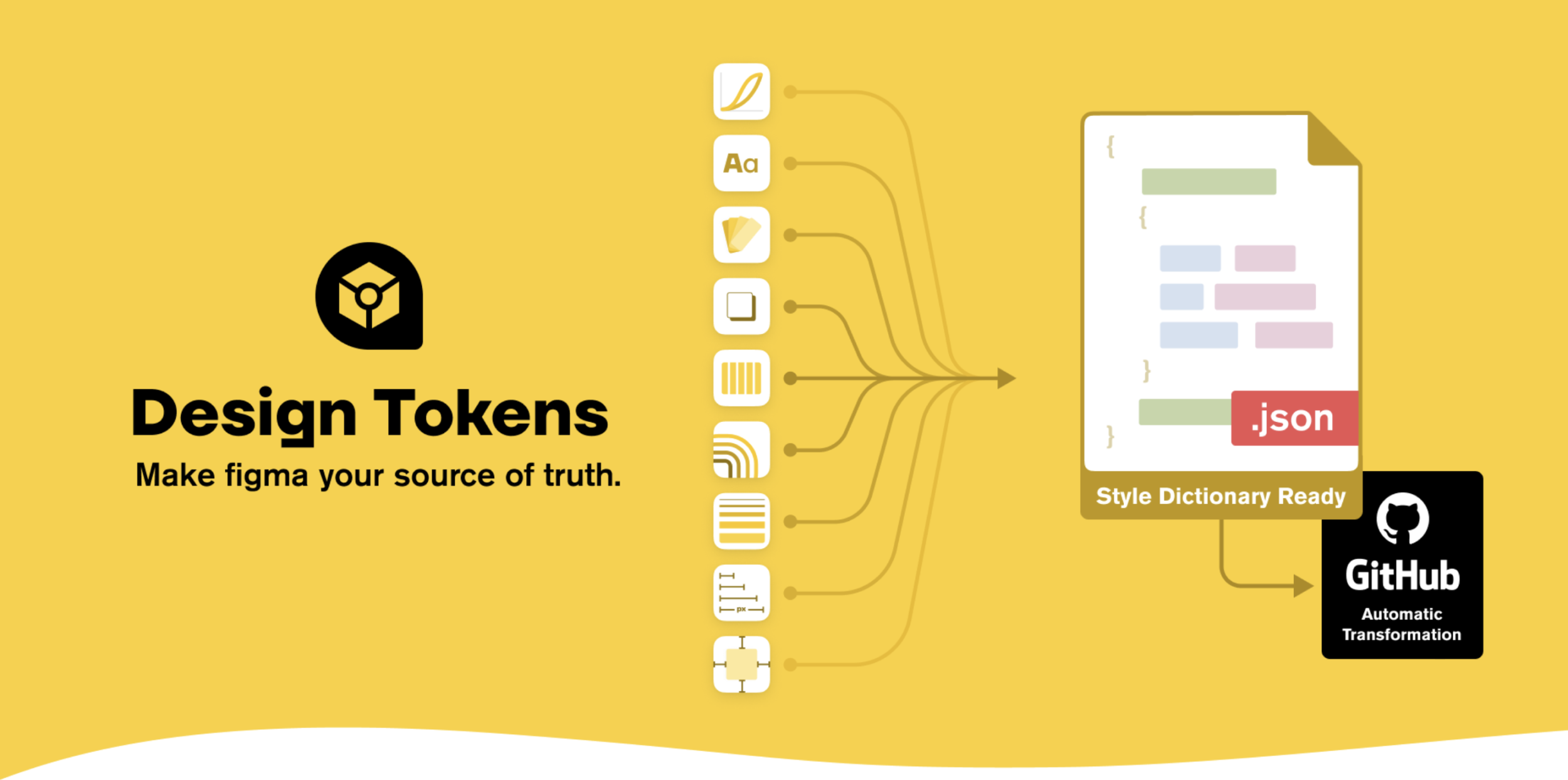
Figma's Variables feature maps almost perfectly onto the three-tier architecture. Collections in Figma correspond to tiers; modes within a collection correspond to themes and brands.
The most important discipline: every value a designer sets in Figma must exist as a token. No hardcoded hex values, no "I'll just eyedrop that". If it's not in the token system, it doesn't go into the product.